It Will Find You - Devlog 5: Environmental Effects
Hi folks,
As a one man team real-life sometimes takes over my devlog cycle, so I apologise for not having published a new devlog in the past few weeks, it's been busy!
This week I thought i'd discuss the environmental effects utilised in It Will Find You to create the raging storm that surrounds Julia, and how they're progressing towards the final product.
Early in development I knew I wanted to environment to be representative of the turmoil in Julia's life, and the struggles she was going to encounter, so setting the events of the game in a storm seemed like a no brainer. This was a great idea at the time, but having never made environmental effects I quickly realised it wasn't going to be as easy as stringing a few simple particle systems together.
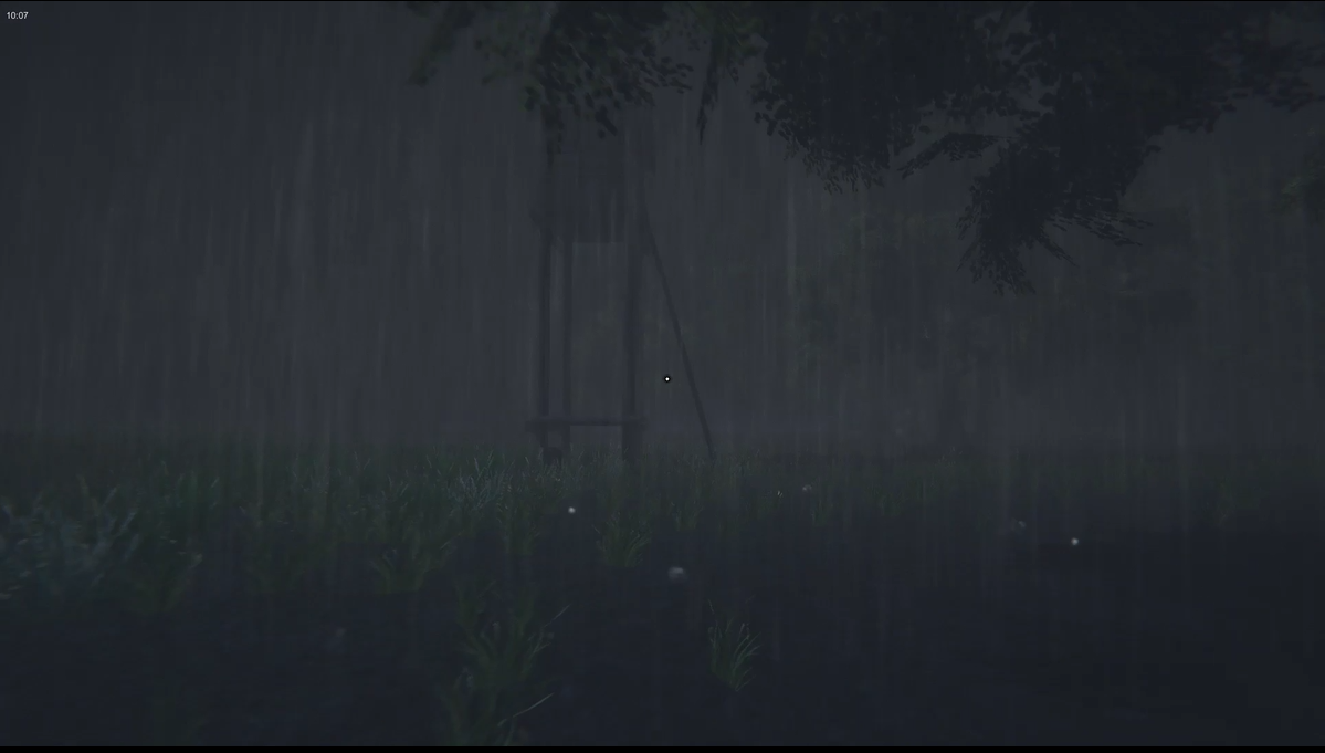
My first port of call was to look at introducing rain to the game in a manner that was realistic and immersive without being frustrating to players, or too expensive for the game to run. My early attempts at a global rain system were therefore naturally a failure on both these counts, as having a particle system large enough to encompass the map, with enough particles to simulate rain, made the performance tank.
After a quick round of research I decided instead to focus on a localised system that would follow the player around, using globally spaced particles to ensure that they didn't move with the player. This began an ongoing juggling act of how big the particle system needed to be, how many particles were required, and how fast they needed to fall to ensure that the player never outran the rain which maintained a natural feeling.

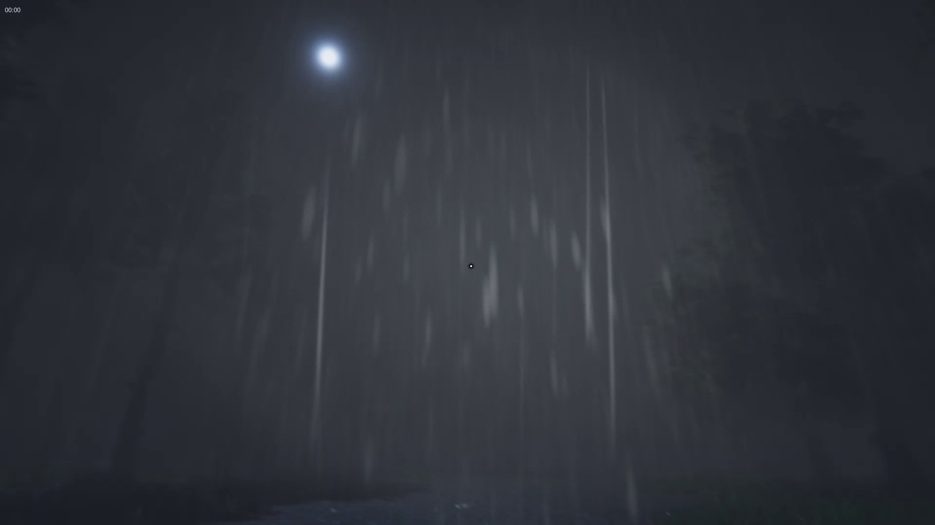
The result of this process was the combination of 3 different particle systems to make up the rain. The first system is a simple particle using an elongated shape to simulate individual rain drops, and this is then combined with 2 texture sheet systems which simulate the bulk of the rain to create a dense and atmospheric rain storm, that is relatively performance friendly. Collisions were then used with the simple particle system to allow for sub-emitters to spawn on the ground and create ripples or splashes upon impact, giving the rain a tangible interaction with the world (which were created using a tiled sprite sheet for animations).
Additional collisions were then applied to all 3 rain systems, as I quickly realised that the rain just came through the roof of every structure Julia visited, a fairly large oversight on my part.
Whilst the rain created a decent level of atmosphere for the storm, it still felt somewhat hollow and lacking in appearance, after all a storm isn't comprised solely of rain. The next stage was an easy one, adding a wind system to the game which would tussle the trees around the map, letting the storm ravage the environment and making every move in a dynamic fashion.
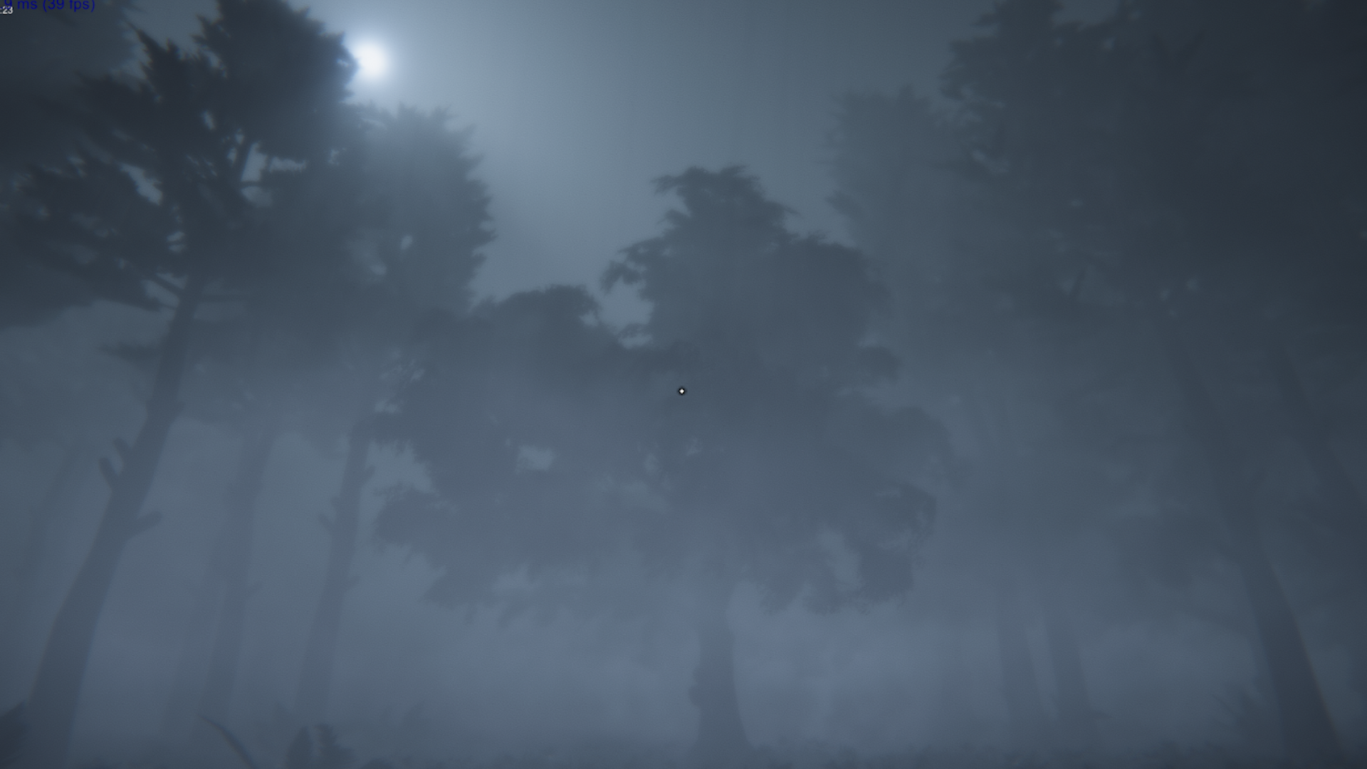
Following this I felt visibility was still too high when exploring the forest under these conditions, and so began work on a fog system for the player using the same logic as the rain. A smaller localised system projecting from a circular particle emitter worked wonders for the fog, and combining this with a texture sheet animation allowed me to get large billowing clouds of fog around the player, with a secondary system creating a smaller, thicker ground layer of fog. As this system was centered around the player it was harder to use collisions to manage the fogs creep inside buildings etc, and so an animation was used to change the radius of the circle emitter, shrinking the radius when outside, and expanding it when inside so that fog could not spawn in the house, but was still visible when looking through windows.
Controlling visibility was a really important part of how the player would interact with the monster, creating additional tension where the player could hear but not see their pursuer, and I feel the system is finally reaching the stage where this is coming into effect.
Finally Aura was used to create volumetric lighting and additional fog based around the central sun source, which really thickened up the environment while providing it with an eerie iridescence. Initially I had wanted the game to be the standard palette of horror game pitch black, but allowing some light with the reduced visibility actually created a more tangible, tense environment for the player to explore.

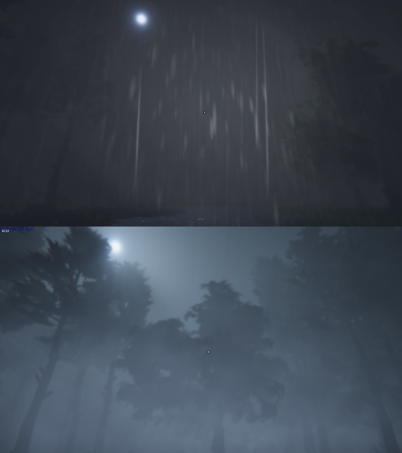
So that brings us roughly up to date with environmental systems from a visual perspective, hopefully you can see from the comparison photo just how much the game has changed in the last few months (hopefully for the better). I'd love to hear your thoughts, so let me know what you think of the visual direction!

That's all for now, so tune in next time for more It Will Find You discussion.
Thanks for tuning in,
Nick
If you want to come discuss the game, have a general chat, or reminisce about Captive Audience, why not join our discord or Facebook pages, or follow us on twitter for more news!
Discord: https://discord.gg/bhgXgH
Facebook: https://www.facebook.com/ItWillFindYou/
Twitter: https://twitter.com/HeraldofLoco
P.S. I realise this was meant to be Pt.2 of the interaction systems, my bad, i'll continue that in devlog 6!
Get Captive Audience
Captive Audience
A first person Narrative Thriller set in the confines of the Dark Web TV show "Captive Audience", a sadistic sitcom.
| Status | Released |
| Author | Captive Minds |
| Genre | Interactive Fiction, Role Playing |
| Tags | 3D, First-Person, Horror, Story Rich, Thriller, tv-show, Unity, Voice Acting |
| Languages | English |
More posts
- 3...2...1... and we're live! It Will Find You - Now Available.Oct 24, 2019
- It Will Find You Itch Page now Live!Sep 18, 2019
- It Will Find You - Devlog 10: How It HuntsSep 18, 2019
- It Will Find You - Trailer #1Sep 11, 2019
- It Will Find You - Devlog 9: Monster AI Part 1 - The CoreAug 29, 2019
- Interim Post - Environmental Screenshots from the latest build.Aug 27, 2019
- It Will Find You - Devlog 8: Monster SelectionAug 21, 2019
- It Will Find You - Devlog 7: Static and Attached ItemsAug 07, 2019
- It Will Find You - Devlog 6: Interactivity PT2Jul 31, 2019

Leave a comment
Log in with itch.io to leave a comment.